New forms can be created and customized on your website, allowing you to collect information from site visitors.
Forms can be used to collect information from website visitors, from pre-planning forms to general questions. You can create new forms on any page on the website.
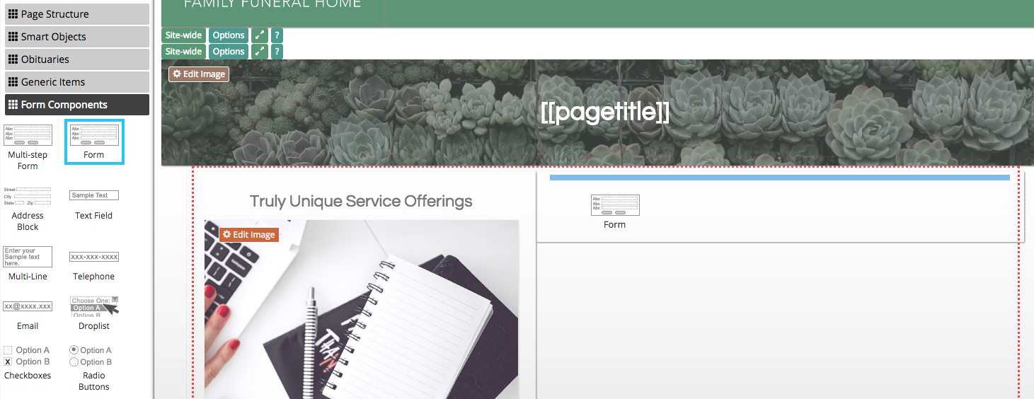
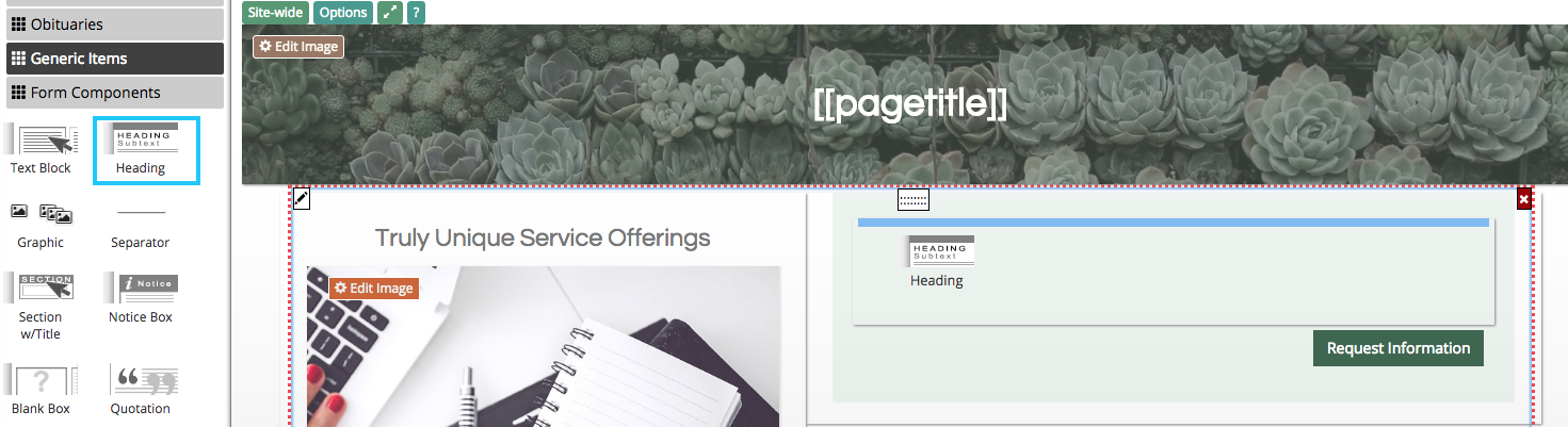
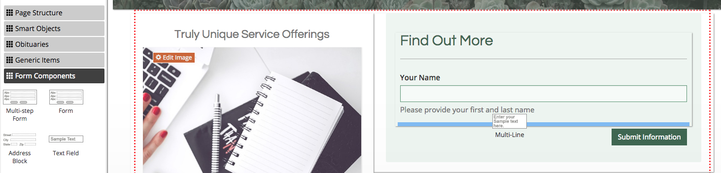
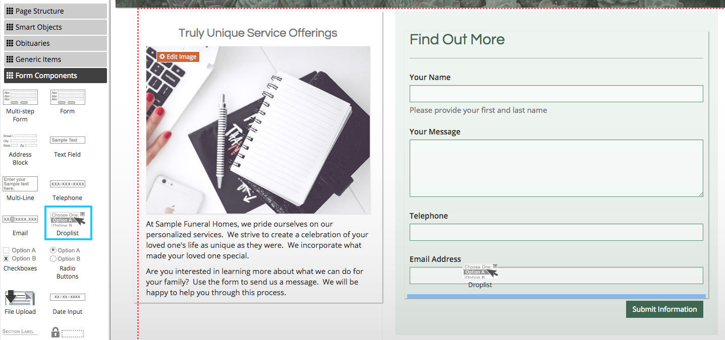
Click on the “Edit” button in the blue bar at the top of the page. A sidebar will appear on the left of the page. From the categories of object, click on “Form Components.”
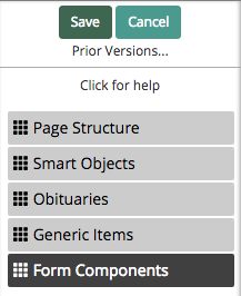
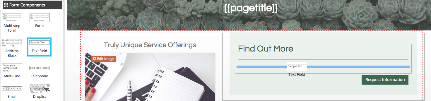
A list of widgets to create and customize forms. Each widget can be clicked and dragged into a form.
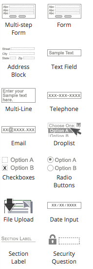
To begin, you will need to create the form itself. Click and drag the “Form” object onto the page. The blue rectangle will show you where the object will appear once you release the mouse button.
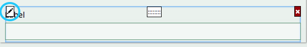
When a form is initially added to your website, it will not contain any fields. Hover your mouse over the form and click the pencil button in the top left corner of the form.
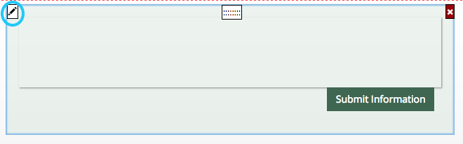
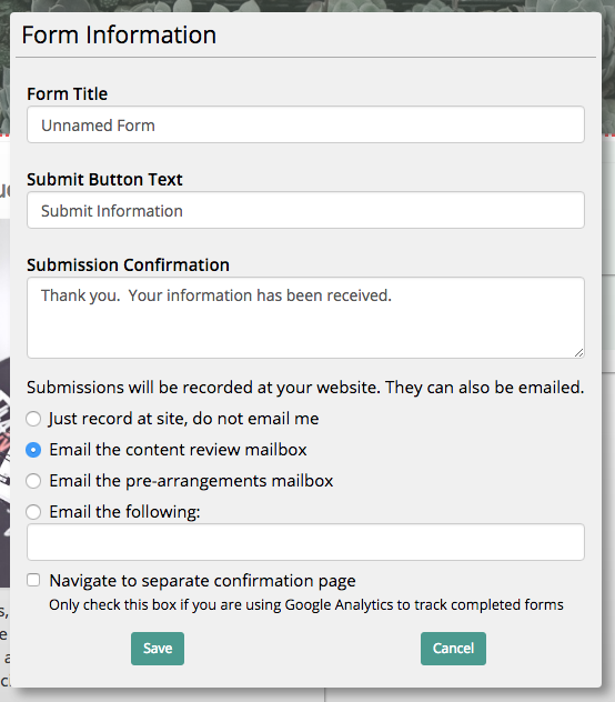
A pop-up box will appear on the screen. The form title will be used when referencing submissions it receives. For example, a new entry on the contact page is labeled by the automated email as “New Contact Us Submission.” Be sure to name your form to track its entries. The submit button text can also be customized, as well as the message presented to users once they have submitted a form entry. At the bottom of the box, you can set what email address(es) receive notifications of submissions. Be sure to click “Save” to update the form settings.
Forms can be customized with various objects, including non-form component widgets. For example, headers and text blocks can be used to label your form. These objects will not affect the submitted information.
Text Field
Form components are necessary to collect information from users. A text field is a basic form component that allows visitors to your website to enter a single line of text.
Hover your mouse over the text field and click on the pencil button in the top left corner.
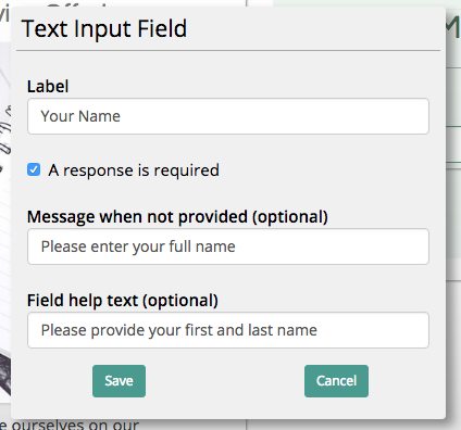
Use the pop-up box to change the text field label. The label should tell users what information to type into this section, such as their name. Field help text is an optional feature that creates text below the field to further explain what they should type into the box.
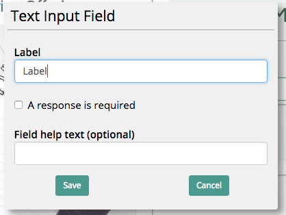
You can also determine whether or not a user can submit a form with this field unfilled. If you require contact information to process a request, check this box for fields collecting an email and/or a phone number.
When this option is selected, you can enter error text shown to users should they attempt to submit the form without the information added.
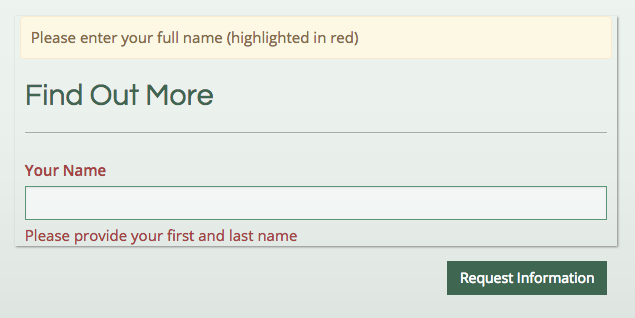
The error text appears at the top of the form in an yellow box. It also highlights the required field and help text in red.
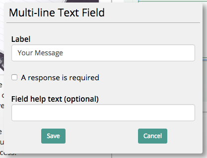
Multi-Line Text Field
A multi-line text field is a larger text box that allows users to enter longer messages.
When editing this object, you will be presented with the same options as the regular text field.
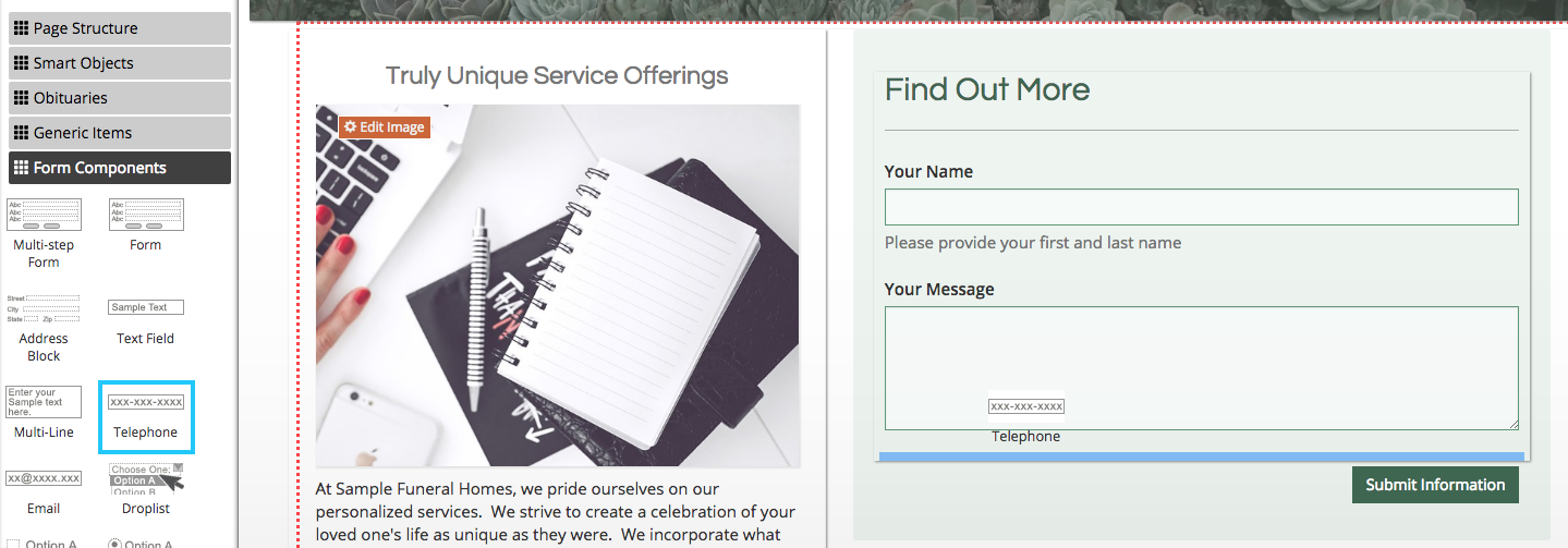
Telephone Field
The telephone field is a text field that will format the phone number when submitted.
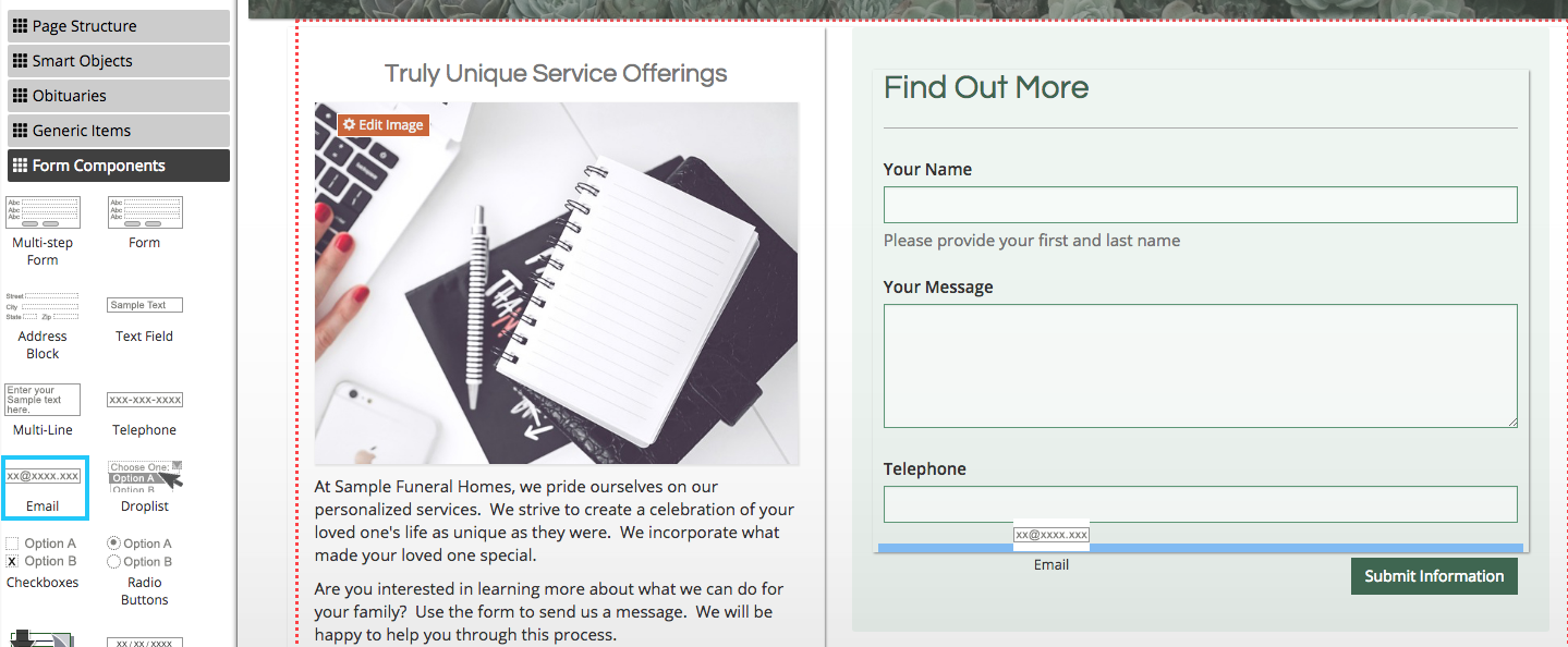
Email Field
The email widget is a text field that will format an email address when submitted.
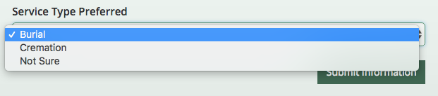
Drop List
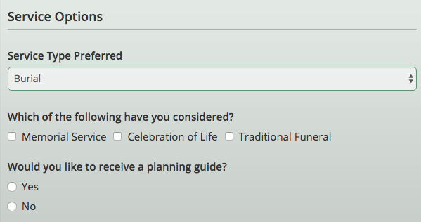
A drop list widget allows users to select from options specified in object settings.
When editing the drop list, enter options in the large text box with one per line.
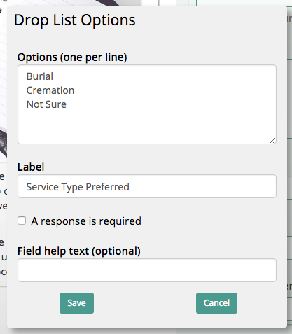
These will be the options users can choose from when entering a form.
Checkboxes
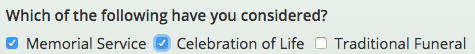
Checkboxes allow users to select multiple options on a form. Options are entered the same way as the drop list widget shown above.
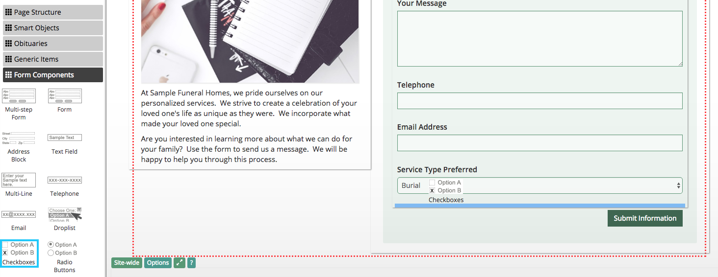
Each option can be selected by clicking the box next to the listing. Multiple can be selected, so it is best not to use these objects on either/or items.
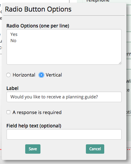
Radio Buttons
Radio buttons are similar to checkboxes in format, but only allow one option to be selected.
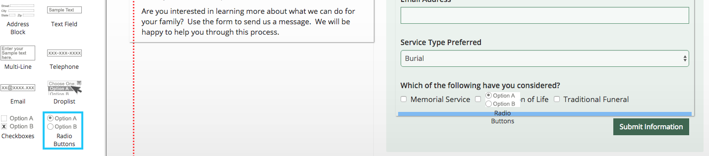
Each item can be displayed either horizontally or vertically by clicking the radio buttons below the text field.
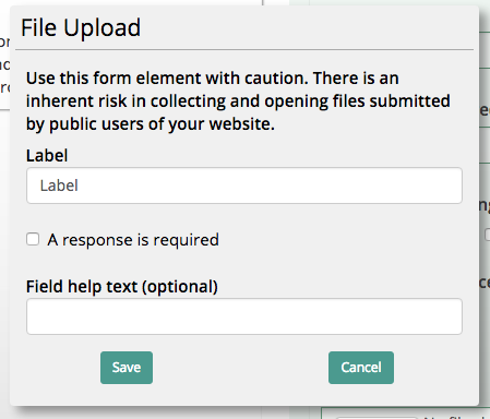
File Upload
The file upload widget allows users to submit a file, such as a picture or document, when entering a form.
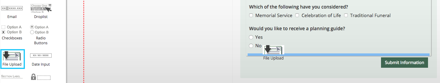
The widget label can be specified in its settings. Be careful using this widget, as users could potentially upload harmful files through your website.
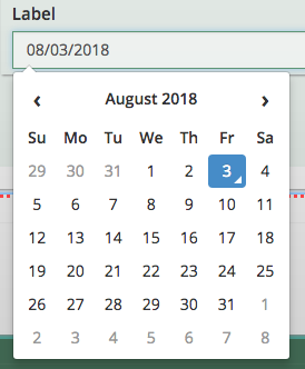
Date Input
The date input widget allows users to use the date picker feature.
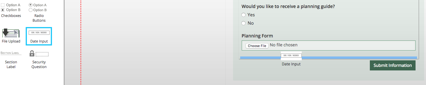
Clicking on the text field will open the picker. Users can still type out the date, or simply click on the day they would like to enter.
Section Label
The section label helps organize forms by creating a title and separator.
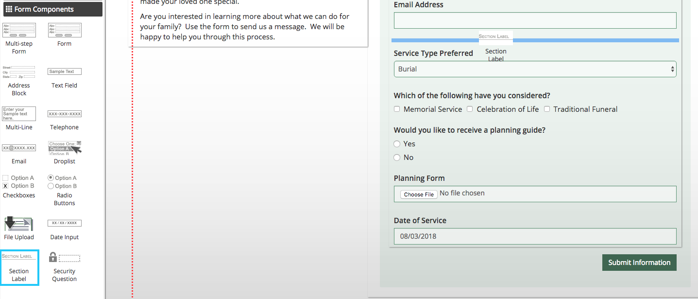
This object does not affect form submissions, but helps to format different sections of the form.
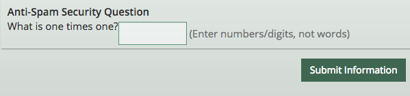
Security Question
You should include a security question at the bottom of every form. This anti-spam object requires users to answer a basic math question to decrease the likelihood of spam.
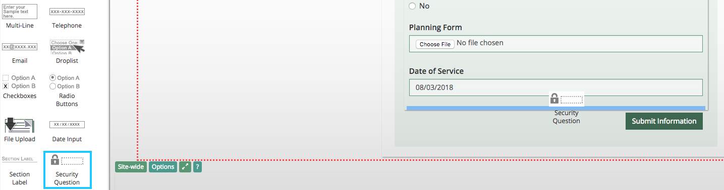
The security question is always a required object. When added, users cannot submit forms until they have filled in the question.
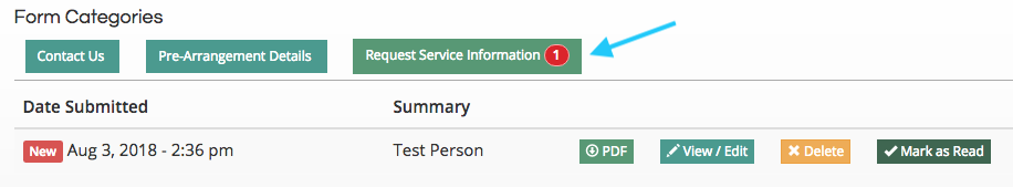
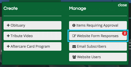
Viewing Form Submissions
All form responses will be recorded on your site in the “Website Form Responses” section. Click the green “Add” button in the top left of the page to access it from the drop-down menu.
Responses will be recorded under the name of the form. They can be viewed, downloaded, and deleted from this page.