Learn more about how generic item widgets can help you create content on your CFS website.
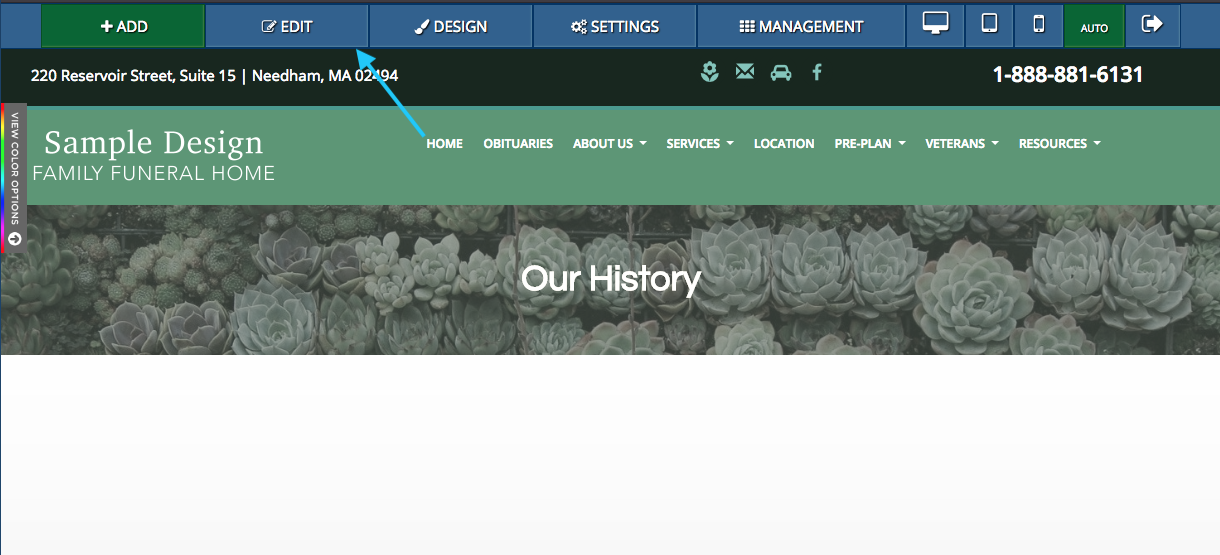
Generic item widgets can be added to pages on your website. These objects are basic components, such as text and pictures. They can be accessed by clicking on the “Edit” button in the blue bar at the top of the page.
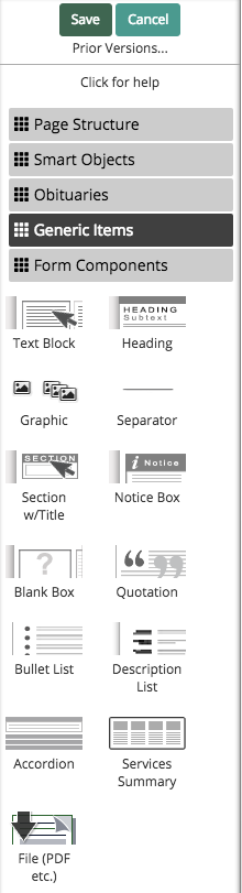
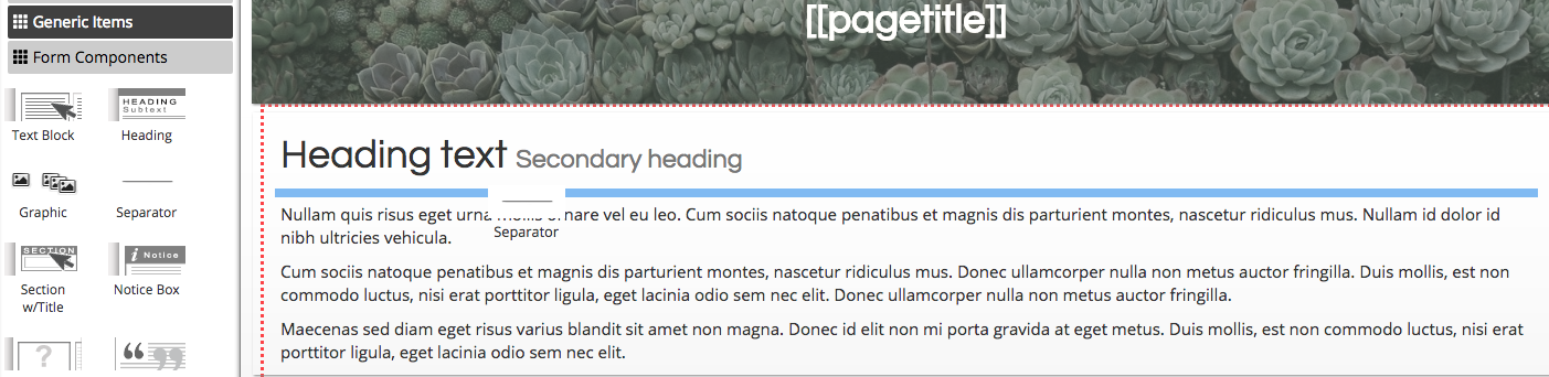
Click on the "Generic Item" button to view all widgets in this category.
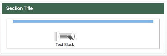
Text Block
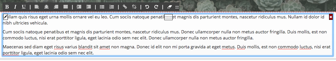
A text block can be directly edited by clicking on it. You can use the black bar on the top of the text block for formatting. Type directly into the box. You can delete the dummy text by selecting it and using the backspace/delete button on your keyboard.
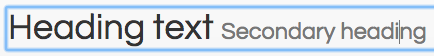
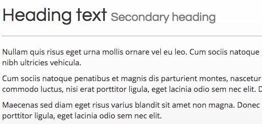
Header
A header is larger title font that can be used to label sections or place larger text on the page.
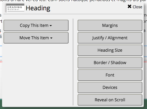
When hovering your mouse over the header, you can click the pencil button in the left corner to adjust its settings. You can make the text smaller by clicking the “Header Size” button from the menu.
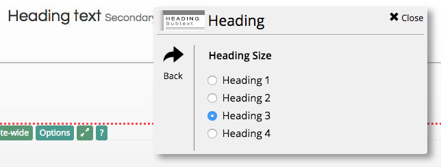
There are 4 sizes available, with “Heading 1” as the largest. Click on the circle button next to an option to change the header size.
Separator
A separator creates a line between two objects. It can be used to define sections of a page.
The separator also has some invisible padding on the top and bottom of it, providing space between two objects.
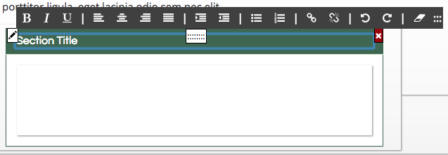
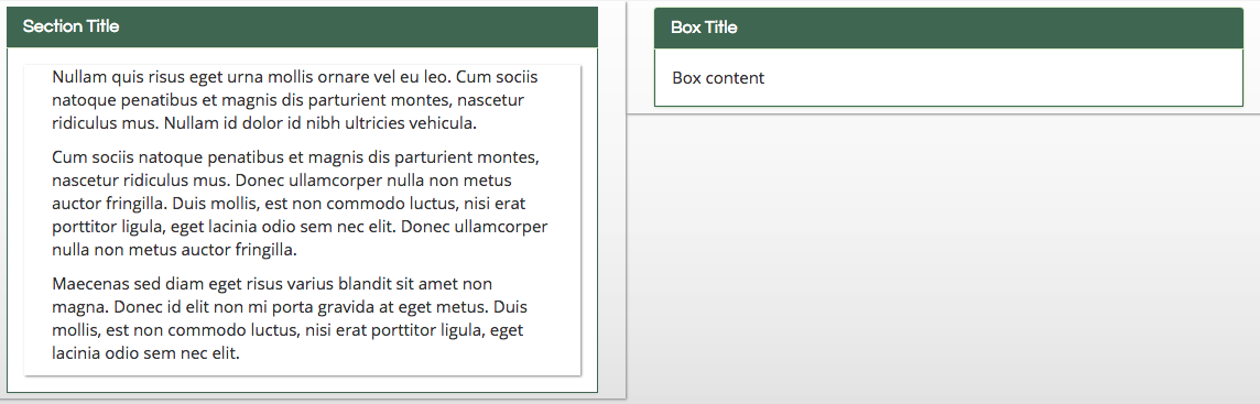
Section with Title
A section with title object is a box with a header at the top.
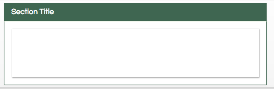
The “Section Title” text can be directly edited by clicking on it.
Other objects can be dragged inside of the box to customize it, including text blocks and smart objects.
Notice Box
A notice box does not have the same level of customization. While the title text can also be edited by clicking on it, other object cannot be dragged inside. Instead, the “Box content” text can be edited by clicking on it.
Blank Box
A blank box creates an empty container with a distinct border.
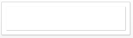
Other widgets can be dragged inside to customize the box.
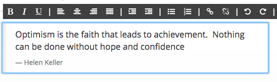
Quotation
A quotation object creates formatted text to enter a quote on the website.
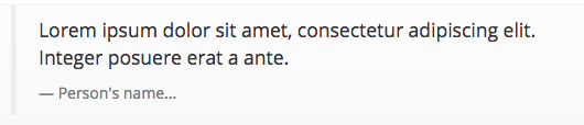
The text can be directly edited by clicking on it.
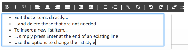
Bullet List
The bullet list object creates a pre-formatted block of text. It can be directly edited by clicking on it.
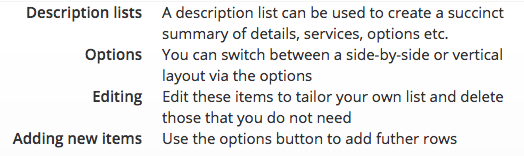
Description List
A description list creates a pre-formatted list of bolded item names and descriptions. It can be directly edited by clicking on it.
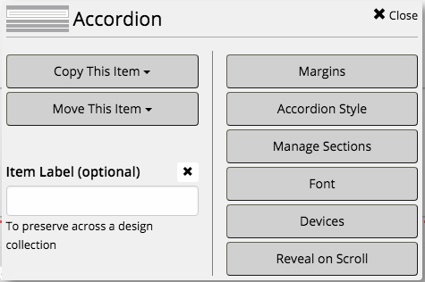
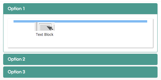
Accordion
An accordion is an object with multiple collapsible sections. Clicking on the section title will reveal the section contents while hiding the rest.
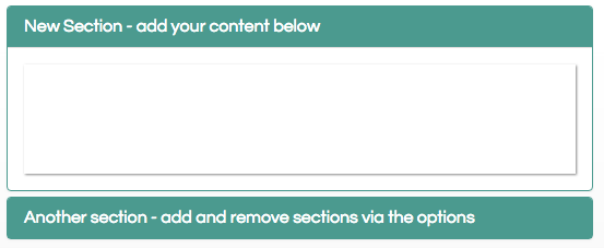
Hover over the accordion object and click on the pencil button in the top left corner. From the pop-up menu, you can add additional tabs by clicking on “Manage Sections.”
Clicking the “Add Item” button will create a new section. Continue to click the button to add more sections.
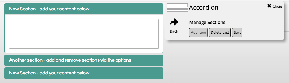
Other widgets can be added inside of each section by clicking and dragging them inside.
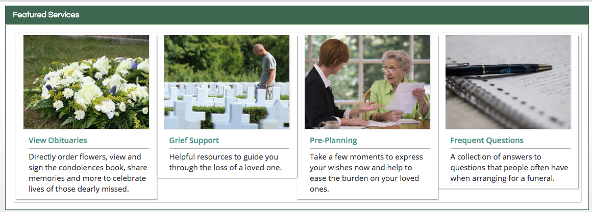
Services Summary
The services summary object creates a section with four sections linking to different stock pages. This widget was featured on many CFS websites on the home page. Our newest designs use navigation tiles and edited graphics instead.
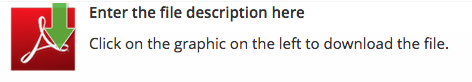
File
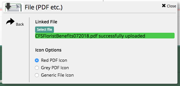
The file object allows you to upload a PDF to the webpage. Clicking the red icon will link to the PDF once you have uploaded a file.
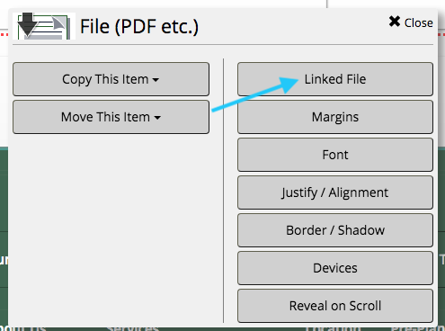
Hover your mouse on the file object and click on the pencil button in the top left corner. From the pop-up menu, click on “Linked File.”
Click on the “Select file” button to upload a PDF.
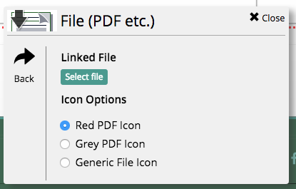
Once the selected file has uploaded to the system, a green bar will appear under the button.