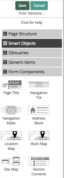
Learn more about the site widgets in the "Smart Objects" category.
Smart objects are widgets that can be added to pages across your website. These widgets are either generated from site content or have more advanced functions when compared to those in the “Generic Items” category.
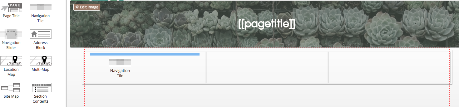
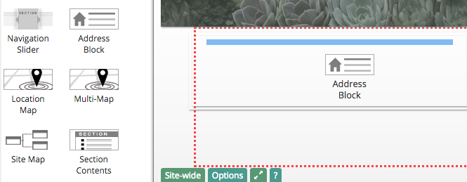
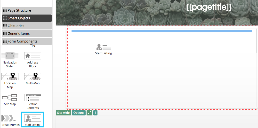
Smart objects can be accessed by clicking on the “Edit” button in the blue bar at the top of the page and selecting the “Smart Objects” button at the top of the sidebar. Click and drag an icon to add a widget to the page.
Page Title
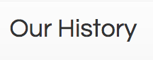
The page title object is a header that is automatically set to the name of the page it’s added to.
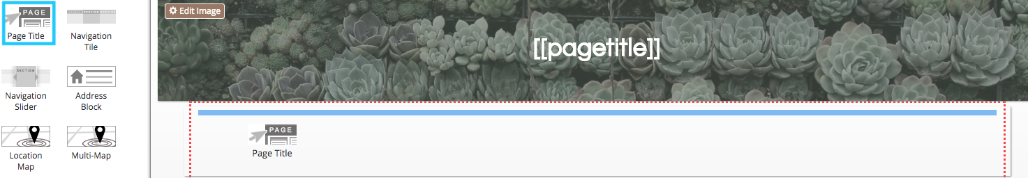
This text cannot be edited by clicking on it. This object is often used in the site-wide header at the top of each page. If the page name is edited, the page title object will automatically update.
Navigation Tile
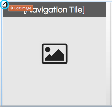
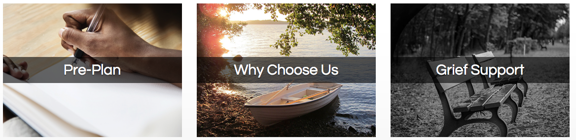
A navigation tile is a hyperlinked image with a text overlay. It can link to either a page on the website or an external website.
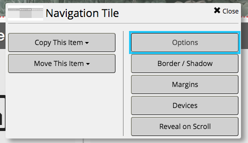
To customize the tile, first hover your mouse on the object. Click on the pencil button in the top left corner of the box.
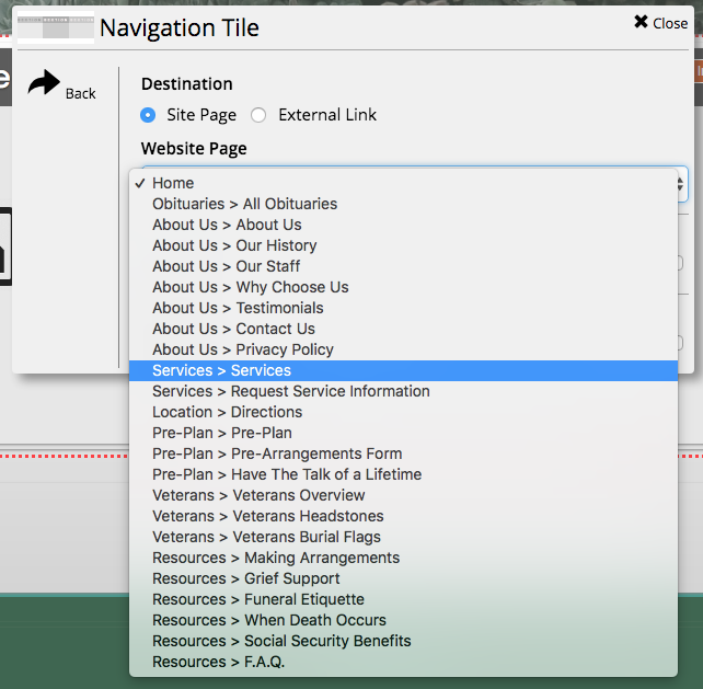
From the pop-up window, click on “Options.”
At the top of the box, you can specify where you would like the tile to link. If linking to a page on the website, click on the drop-down menu underneath “Website Page.”
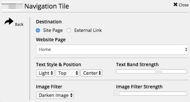
Select the page you would like the tile to link to. The text on the navigation tile will automatically update to the page title.
Once you have selected the link, close out of the pop-up window. To set the picture, click on the “Edit Image” page in the top left corner of the box.
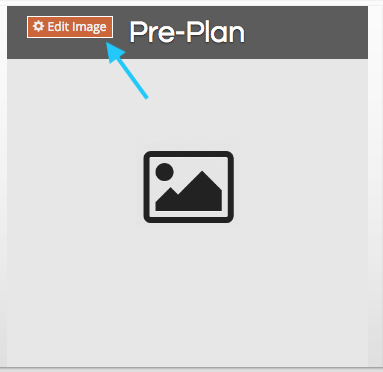
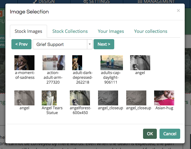
Use the image selector pop-up box to add an image to the tile.
Multiple navigation tiles can be added to a page.
Navigation Slider
The navigation slider rotates through different pages linked in a section of the website.
The content of this object is defined by specific design layouts. If you would like to add this feature to your website, contact CFS at support@runcfs.com.
Address Block
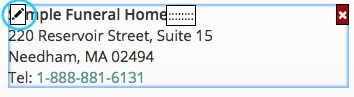
The address block is a pre-populated text block that formats the address of the funeral home as defined in site settings.
If you have multiple locations, you can change which address the block displays. Hover your mouse over the object and click on the pencil button in the top left corner of the box.
From the pop-up window, click on “Location Address.”
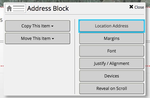
Use the radio buttons next to each location name to toggle the address displayed in the block. Below, you can also customize display settings.
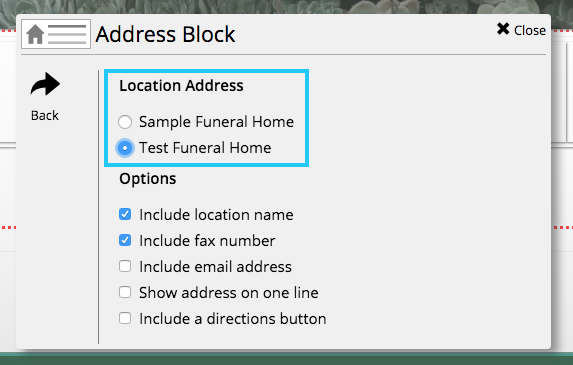
The address cannot be directly edited by clicking into it. If your street address or contact information is changed in site settings, all address blocks on the website will automatically update.
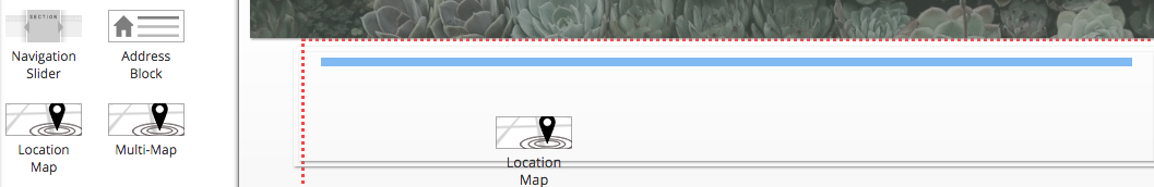
Location Map
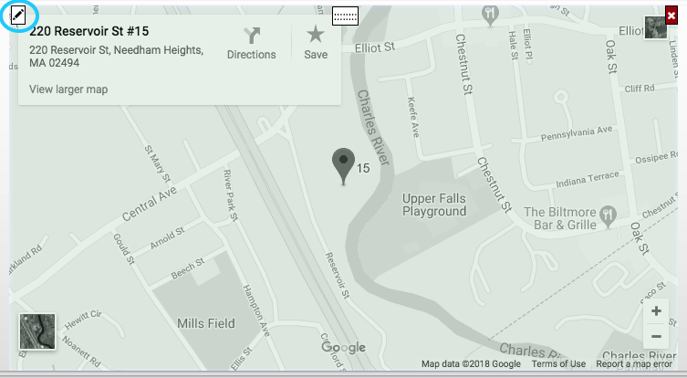
The location map generates a preview map of the funeral home location. Depending on site settings, it may have a transparent color overlay.
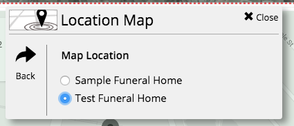
If you have multiple locations, you can change which address the map displays. Hover your mouse over the map and click on the pencil button in the top left corner of the box.
From the pop-up menu, click on “Map Location.”
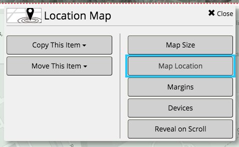
Select the radio button next to the location you would like displayed on the map.
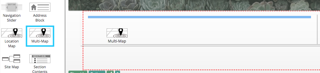
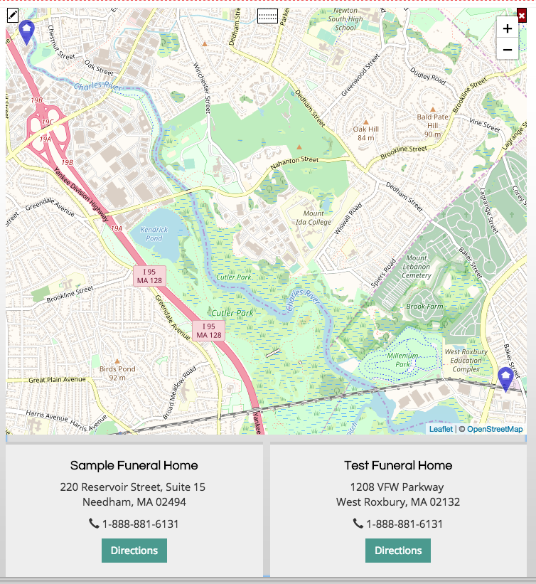
Multi-Map
The multi-map generates a preview map of all locations defined in site settings. If you have multiple locations, all will appear on the map together.
Clicking on each address will highlight that location on the map. There is no limit the number of locations that can be added to the map.
Site Map
The site map generates an outline of pages on your website. This object is typically added to the footer of CFS websites. The map will update when pages are added, renamed, or deleted.
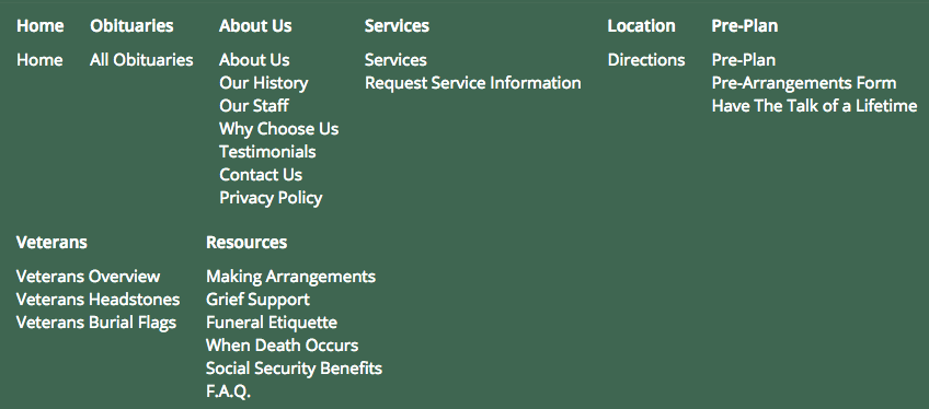
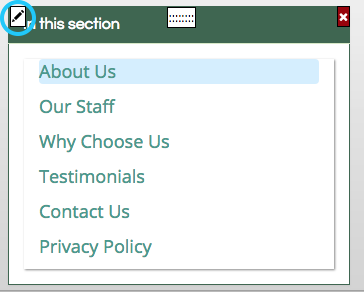
Section Contents
The section contents widget generates a box with links to all pages in the same menu section. CFS designs have these objects on most stock pages. They make it easier for website visitors to navigate through the website.
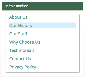
This widget can also be formatted as a horizontal strip.

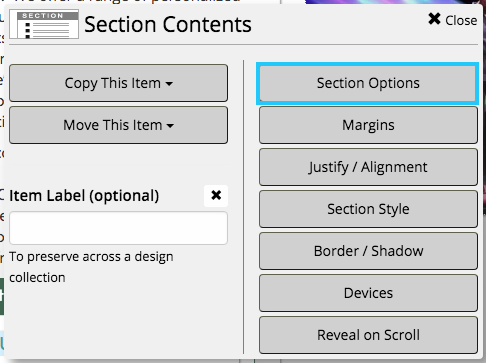
To change the listing option, first hover your mouse over the section and click on the pencil button in the top left corner.
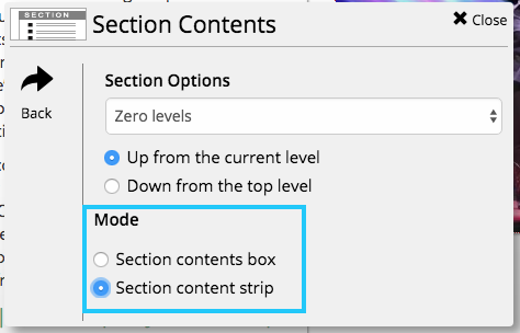
From the pop-up menu, click on “Section Options.”
In the bottom section, click on the radio button next to the listing option you would like to use.
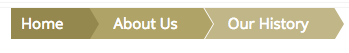
Breadcrumbs
Breadcrumbs show the current section and page a user is on. This is a helpful widget if you have many nested sections in your website.
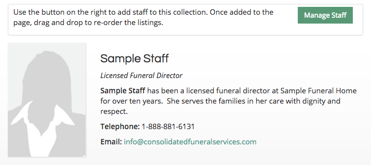
Staff Listing
The staff listing widget allows you to display staff titles, contact information, bios, and a photo.
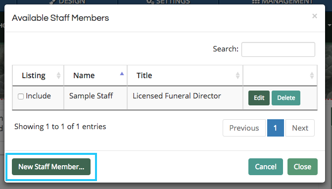
When first adding the widget, you will need to enter staff members by clicking the button in the bottom left corner of the pop-up box.
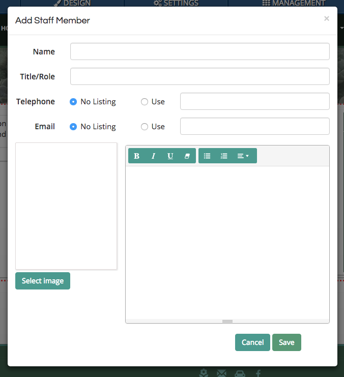
Use the fields to enter each staff member’s information. You are only required to enter a name. All other fields can be omitted as needed. Be sure to click the “Save” button in the bottom right corner of the window to create the listing.
Once you have added a staff member, click the check box next to “Include” on the left side of a listing. Then click the “Close” button in the bottom right of the box.
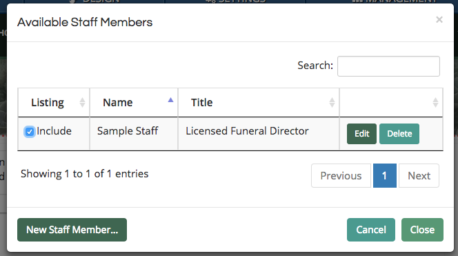
Multiple staff listing widgets can be added to your website. While all staff widgets will be connected to the same collection of added members, each can display a different selection.
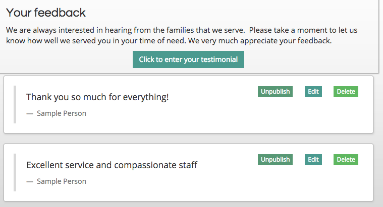
Testimonials List
The testimonials list widget displays all testimonials submitted through your website, as well as the button used to collect new entries. This object is on the CFS stock testimonials page.
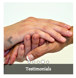
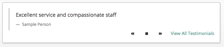
Testimonial Rotator
The testimonial rotator will automatically display all testimonials entered on the website in a scrolling box.
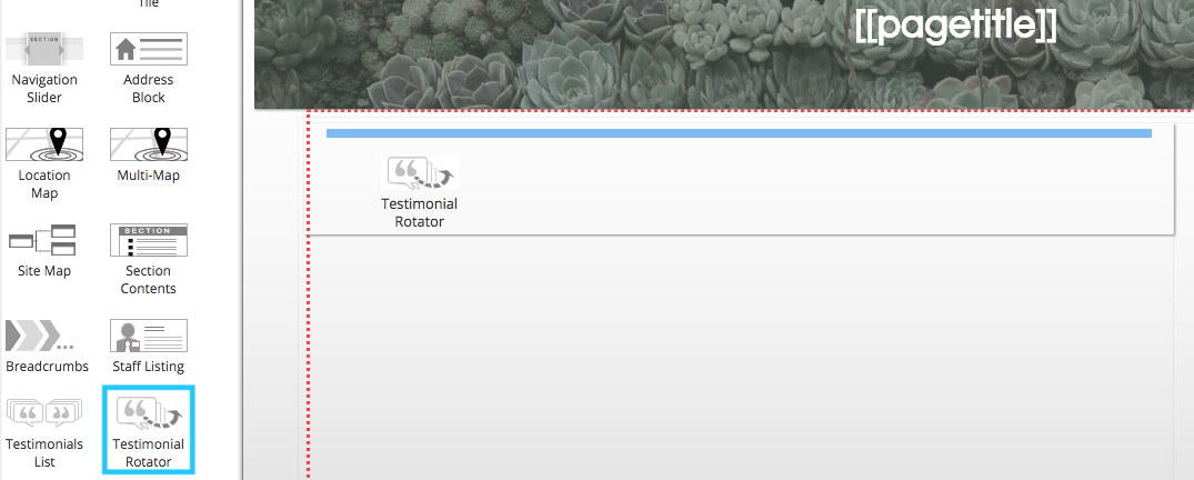
Users can click on the buttons in the bottom right corner to scroll through entries and navigate to the testimonials page on the website.
Grief Emails
The grief email sign-up widget allows website visitors to sign up to receive daily support emails with your funeral home’s name included.
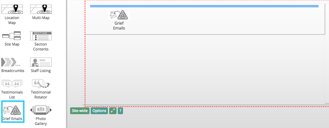
This is a popular feature on CFS websites. CFS will automatically dispatch these daily messages on your behalf. You can also track active subscribers in your website settings.
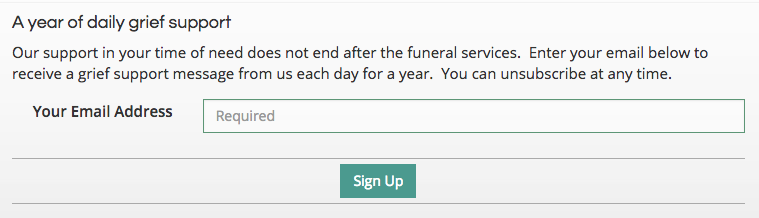
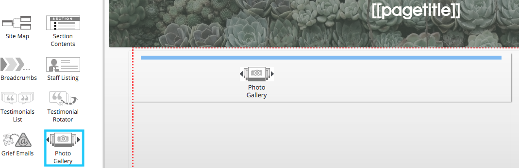
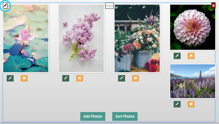
Photo Gallery
The photo gallery widget allows you to create a collection of images on a page.
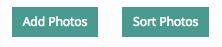
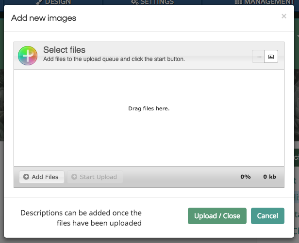
Click on the “Add Photos” button.
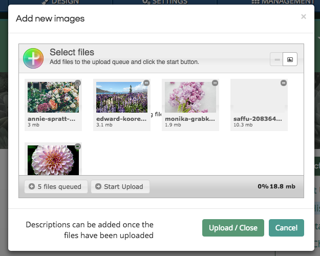
Use the photo uploader to add images to the gallery. You can add as many photos to a gallery as you would like. Files can be entered by either dragging them into the white box from your desktop or by clicking the “Add Files” button in the bottom left corner of the box.
Once you have entered some photos, click on the “Upload / Close” button in the bottom right of the pop-up window.
The photos will now appear in the gallery. Instead of static rows, the gallery will arrange the photos to fit together compactly. A larger version of each photo can be viewed by clicking on it.
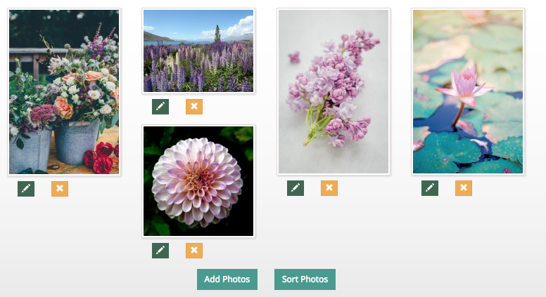
Click the “Sort Photos” button to rearrange the order of the images. Click and drag the image preview to reorder them. Click “Stop Sorting” when you are finished.
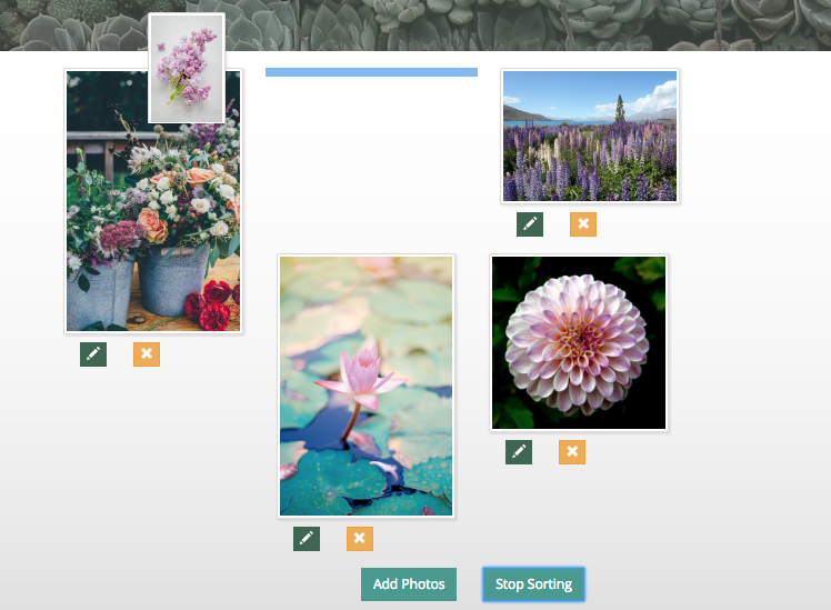
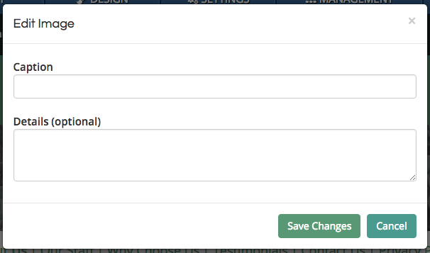
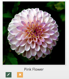
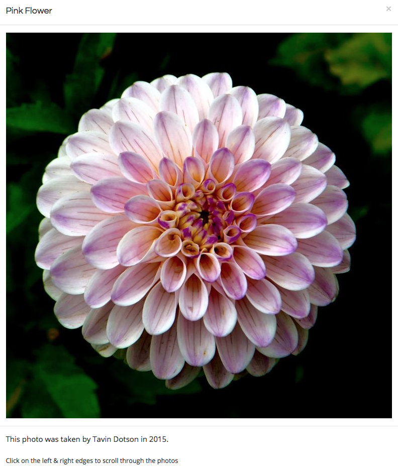
Each photo can include a caption and a description. The caption will appear underneath the photo in the gallery, while the description will only appear when a user clicks on the photo. To add a caption and description, click on the pencil button below the photo.
Use the pop-up box to enter a caption or description. You can leave either field blank if desired. Click “Save Changes” to update the photo.
The caption will appear directly below the picture.
The description text is shown underneath the photo when viewing the full version.
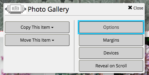
The photo gallery has two display options. Hover your mouse over the collection and click on the pencil button in the top left corner.
From the pop-up menu, click on “Options.”
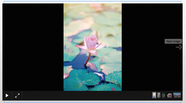
From here, you can toggle between the grid and scrolling galleries.
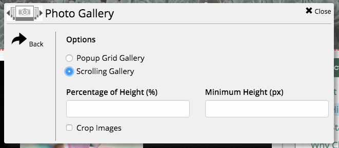
The scrolling gallery shows one photo at a time. Website visitors can use the arrows on the left and right side of the box to browse through the photos.
Translator
The translator widget embeds a Google translate program on the page.
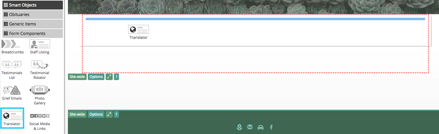
Clicking on the “Select Language” drop-down menu will allow users to select from a large selection of languages.
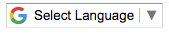
The widget will detect and translate text on the website. It will not affect images such as your website logo. When a language is selected, as shown below, the application will translate all text on the page. This widget can be added to the header and footer on your website to provide this option on all pages.
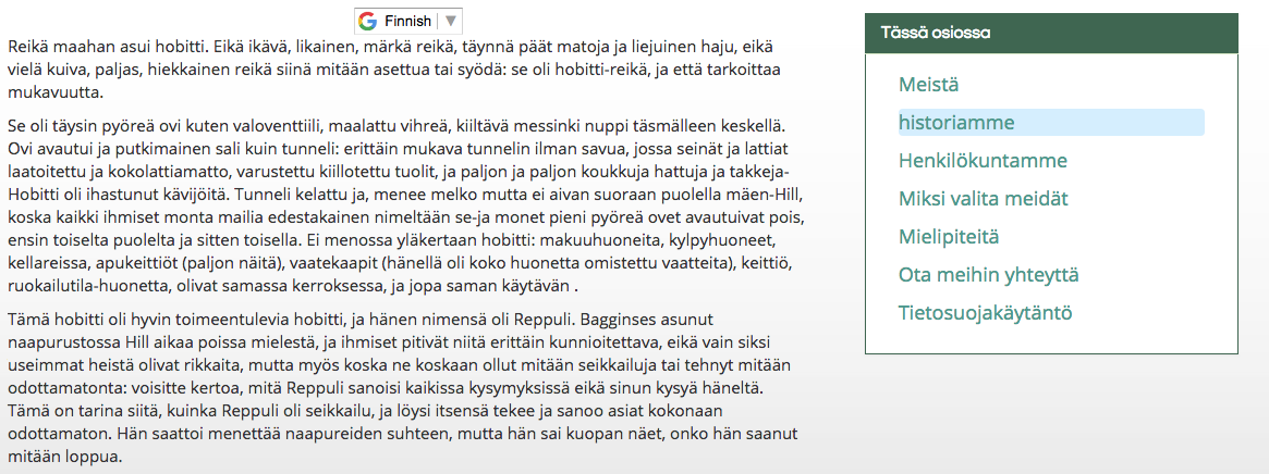
Social Media & Links
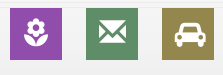
The social media & links buttons can be customized to link to different pages on your website.
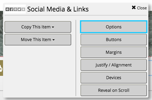
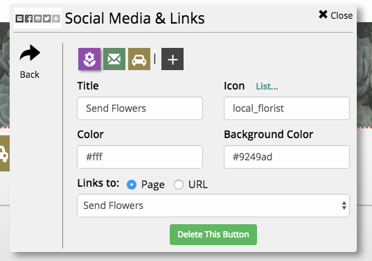
The default buttons will be large and square. Their appearance can be customized by hovering your mouse over the object and clicking on the pencil button in the top left corner.
From the pop-up menu, click on “Options.”
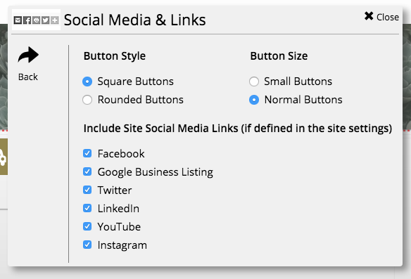
Buttons can be toggled as round or square. They can also be set to a large or small size.
Click the “Back” button in the left side of the box to return to the menu. Click on “Buttons” to add, edit, or delete buttons.
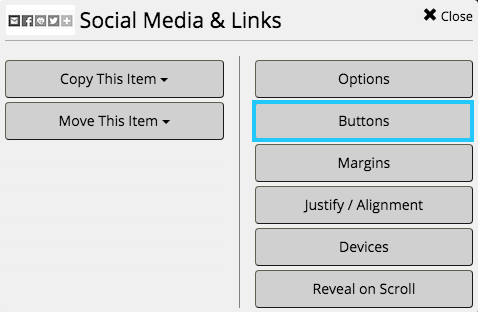
Edit each button by clicking on its icon. You can change its name, icon, color, and background color. Both are defined in hex triplet code. Use a website such as www.colorhexa.com to generate the code for a color.
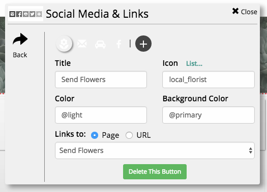
This widget is often included in CFS designs. For example, these buttons are defined by the website’s color scheme.
The color and background color are defined with tags from the design master. If you change the color scheme of your website, these buttons will automatically match the new design.
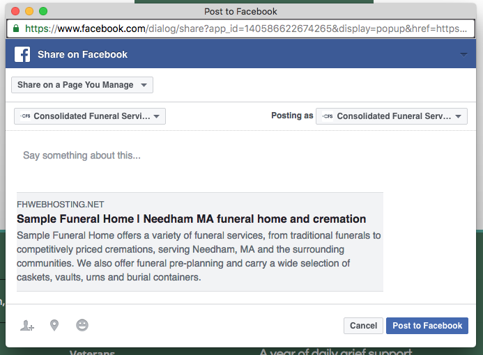
Share Button
Share buttons allow users to share a page from your website on social media. This does not include obituaries, who have share buttons built in.
The shared post will link back to your funeral home website.
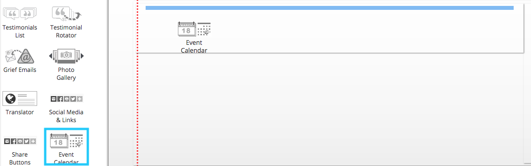
Event Calendar
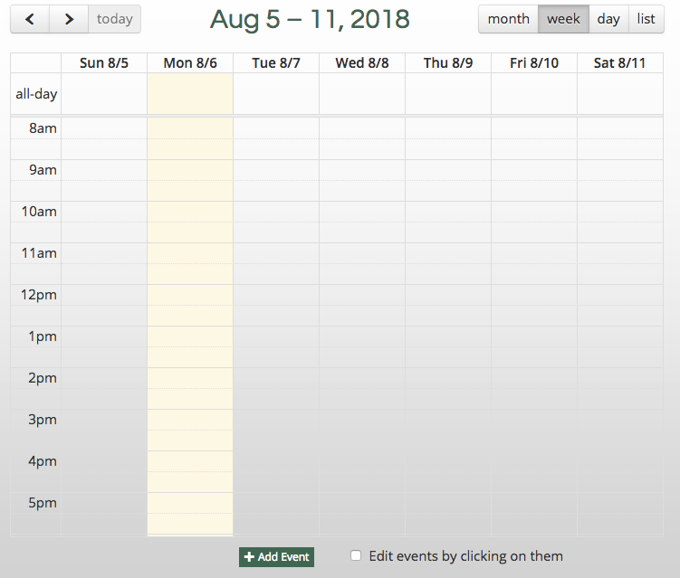
A event calendar allows you to display upcoming events and services at your funeral home.
New entries can be added by clicking the “Add Event” button at the bottom of the widget.
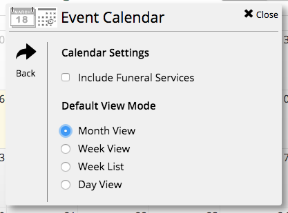
The default view can be changed in the widget settings. Hover your mouse over the object and click on the pencil button in the top left corner of the box. From the pop-up menu, click on “Calendar Settings.”
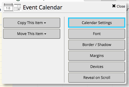
From this menu, you can choose to include upcoming funeral services. You can also switch the default view to day, week, week list, or month view.
Embed Code
The embed code widget is the most versatile object. It allows a user to enter code directly into a page.
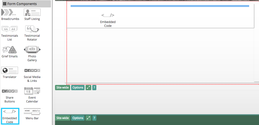
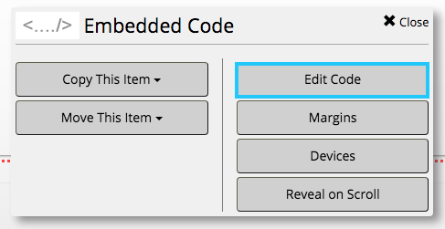
The widget will initially appear as a thin red rectangle. Hover your mouse over the outline and click the pencil button on the left side.

From the pop-up menu, select “Edit Code.”
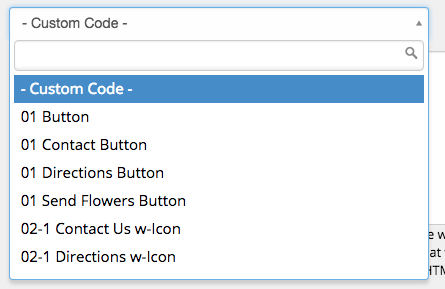
You can add HTML directly to the white text box. Alternatively, browse code snippets in the CFS stock library by clicking on the drop-down menu highlighted below.
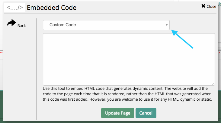
Use the search bar to look for specific coded objects, or scroll through the drop-down menu to browse available objects. Each can be customized by directly editing the HTML.
Menu Bar
The menu bar is a horizontal navigation tool. Most CFS designs use this widget as the menu in the header of the website. It is not recommended that you add additional menu bars to your website.

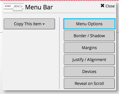
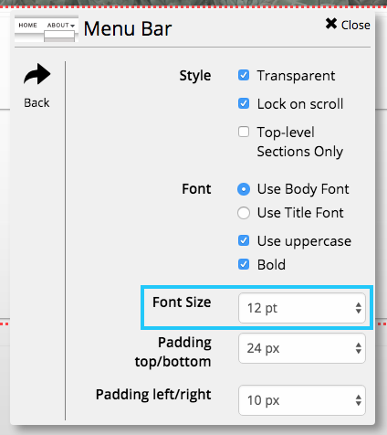
The menu bar already on your website can be edited to increase the font size. Hover your mouse over the menu bar and click on the pencil button in the top left corner of the object. From the pop-up window, click on “Menu Options.”
In the bottom section, you can change the font size by clicking the drop-down menu in the section highlighted below.
Vertical Menu
A vertical menu is functionally identical to the menu bar object. Some CFS designs use this widget as the main menu in the sidebar of the website. It is not recommended that you add additional menu bars to your website.
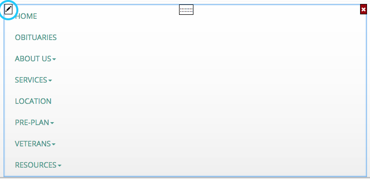
It can be edited by hovering your mouse over the menu and clicking on the pencil button in the top left corner. The vertical menu has the same options as the menu bar object.
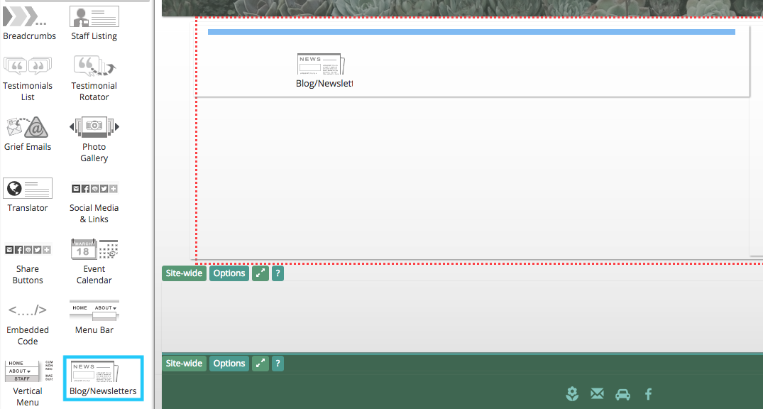
Blog / Newsletter
This widget can create a basic blog or newsletter on a website page.
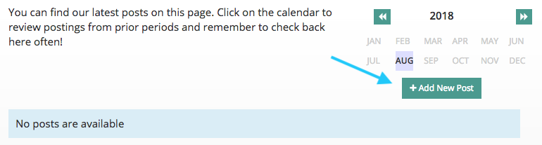
Once added, you can create new blog or newsletter posts by clicking the button underneath the month-view calendar.
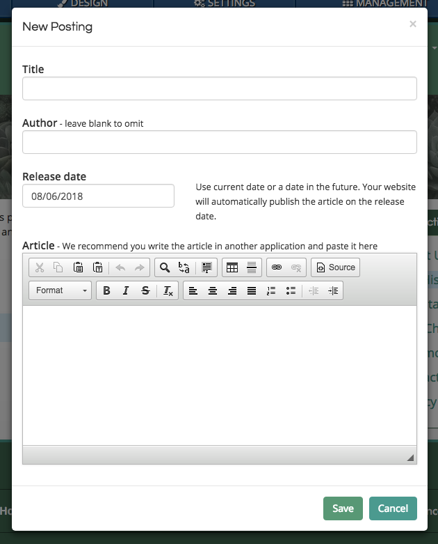
Use the pop-up window to enter a post.
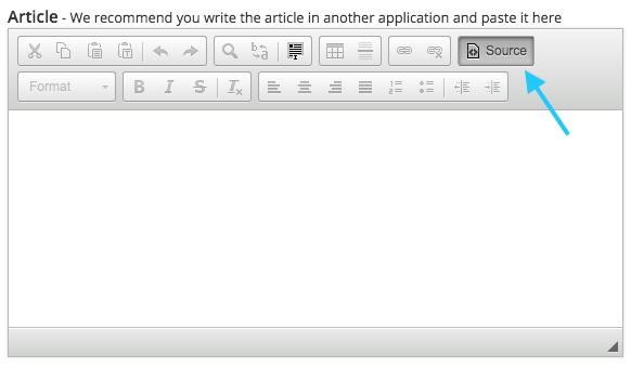
To directly embed objects such as photos or videos, you can switch to entering HTML with the “Source” button on the right end of the top row.
Merchandise
The merchandise widget displays store lines on your website, creating an online showroom for caskets and other products.
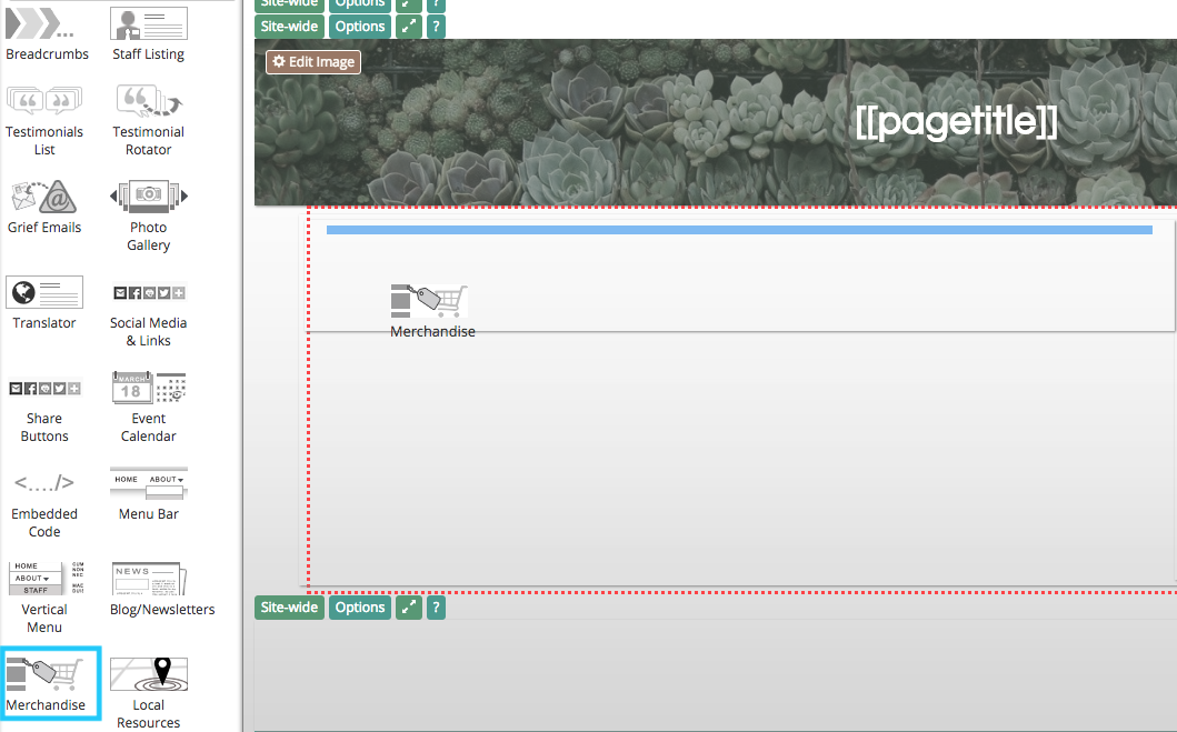
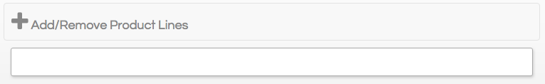
Once on the page, you can add product lines to the widget by clicking on the top section.
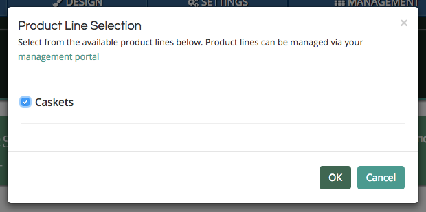
Merchandise lines are defined in the “Management” section on your website. If you want to learn how to create lines, visit our merchandise tutorial page.
Related: Add Merchandise to Your Website
Once lines are added to your website, you can select them from the pop-up window by clicking on the check box next to each line title.
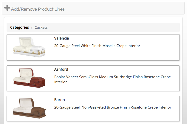
The product line will now appear below the “Add/Remove” button at the top of the widget. This button is not visible on the public side of your website.
Local Resources
The local resources widget creates a directory of helpful links. This object is most commonly used to list area hotels, churches, cemeteries, and restaurants.
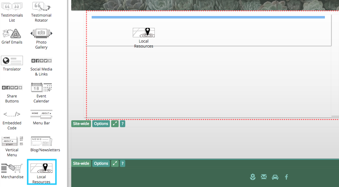
Use the “Add Section” button to begin creating listings.

A pop-up menu will appear on your screen. Enter the name of the new section in the text box. Click “Save” to create the category.
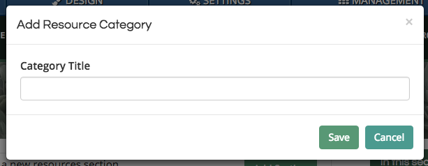
You can add multiple categories to the widget.
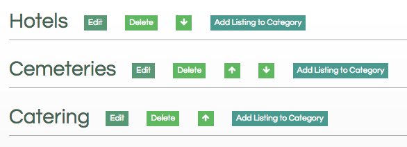
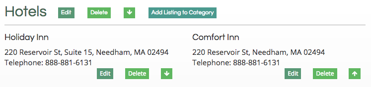
When you have added listings, they will appear automatically formatted under the category they were added to.
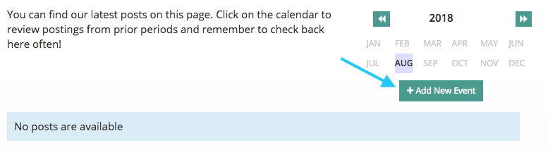
Events
The events widget will list events by month view. It allows more details to be added for an even than the calendar widget.
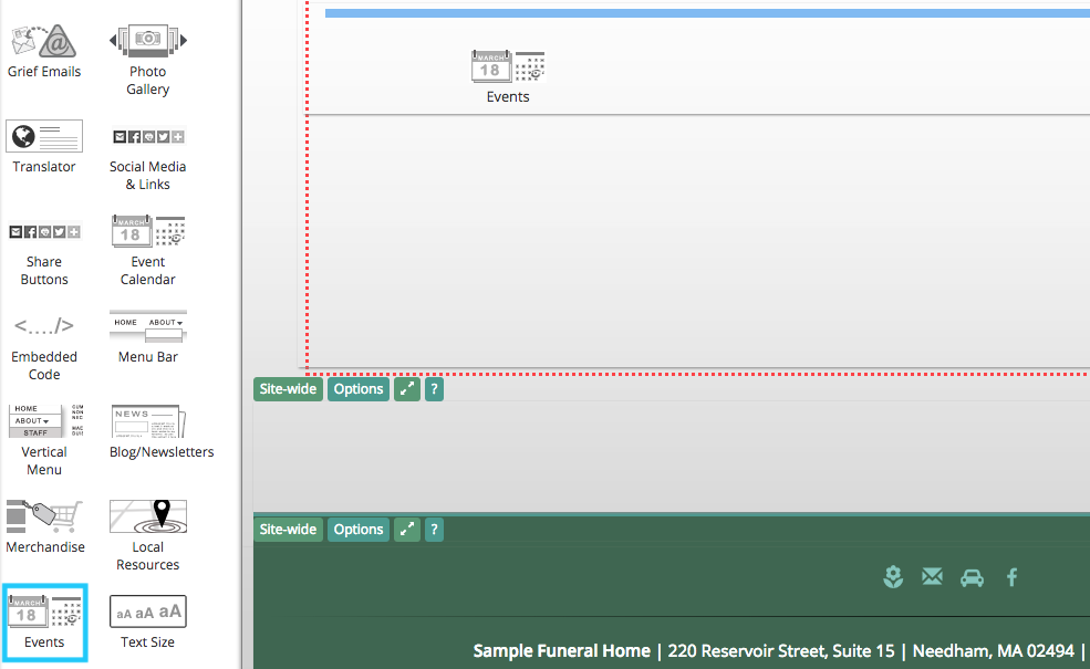
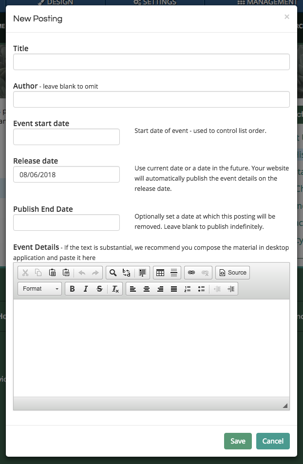
Click the “Add New Event” button underneath the month-view calendar to create a new post.
Use the pop-up window to enter the event. Be sure to click “Save” in the bottom right of the box to create the listing.
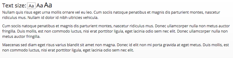
Text Size
The text size widget will dynamically change the font size on a webpage.
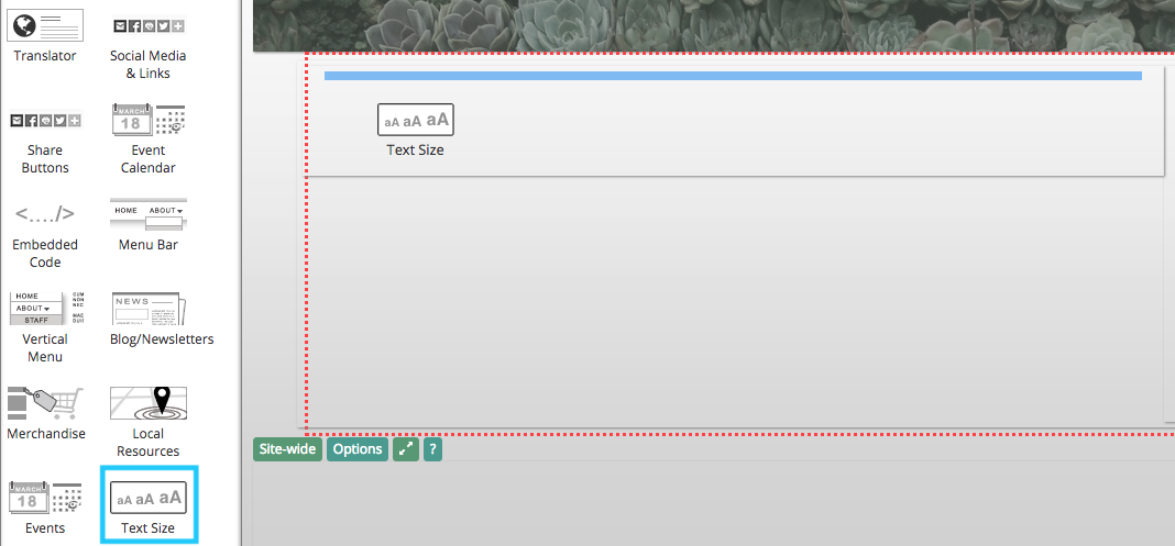
Website visitors can choose from three size options. All text on the page will be resized.
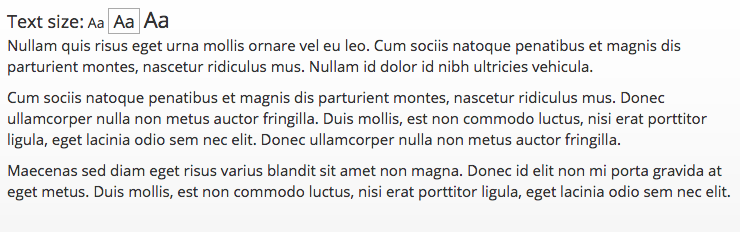
Clicking on the preview box will change the size.
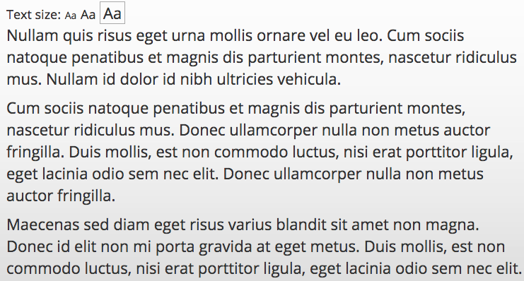
Users can switch between small, medium, and large print.
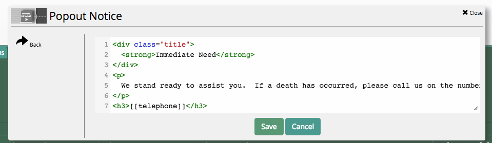
Popout Notice
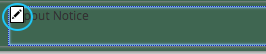
The popout notice is a box that will appear in the bottom right corner of the page. This object is often added to the footer on the website. This will make the box appear across the website. If a user closes the box, it will remain hidden when clicking on different pages or links.
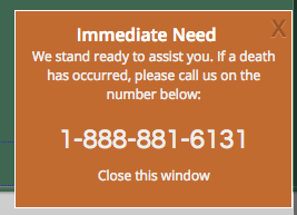
If a popout notice has been added to the footer of your website, its content can be edited by finding the small text that says “Popout Notice.” Hover your mouse over the text and click the pencil button in the top left corner.
From the pop-up menu, click on “Popout Content.”
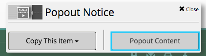
The text in the notice can be directly edited by replacing the black text. Click “Save” to update the box.